Brief
Work applications should be productive because of their repetitive usage. Compared to the inspiring product, the major flows of the redesigned clock-in app will be simpler.
I did UI ideation on my own, and prepared the onboarding document for future members.
The Problem
The company I worked for used an app with clock-in, leave forms, and salary information. One had to go back to the “Main Menu” as there was another task to do. I wished the flows were more straightforward.
To Clock-in
Main Menu Clock-in Screen Clocked-in
To Clock-in + Confirm Leave Forms
Main Menu Clock-in Screen Clocked-in Main Menu Confirm Leave Forms Screen Confirmed
Question
How might we simplify the flows of the routine tasks in a clock-in app?
Redesign the Navigation
🤔 Initial IdeaAn All-in-on Dashboard
I put clocking and form tasks in one place like an all-in-one dashboard. There’s no need to switch between the tasks.
Feedback
“It’s great to see the major tasks in one dashboard. However, they are overcrowded on mobile devices.”
↪️ 1st IterationTab Bar

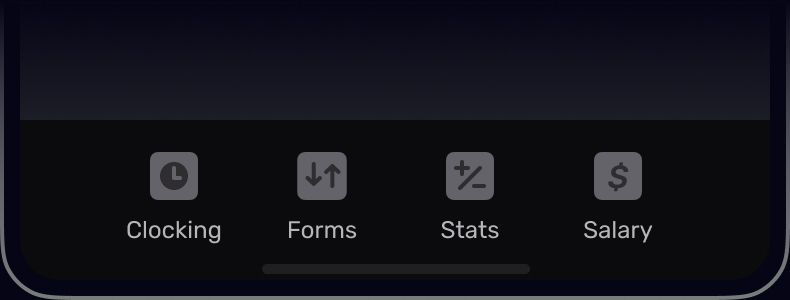
Tab Bar (Bottom Navigation) fulfills “Where am I?”, “Where else can I go?”, and “What will I find when I get there?” requirements* for the navigation design. The Main Menu design, on the other hand, allows us to go back.
| Tab Bar | Main Menu | |
|---|---|---|
| Where am I? | ||
| Where else can I go? | Primary Tasks | Go Back |
| What will I find when I get there? | Last Screen |
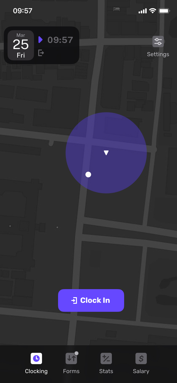
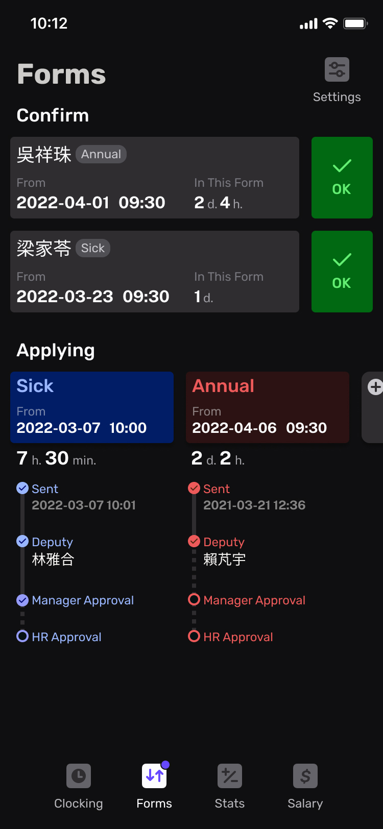
To Clock-in + Confirm Leave Forms
Please give it a try by the following prototype: You are approaching your company’s physical office on a working day and ready to clock in. You open the app and find your colleague’s leave form is waiting for your confirmation.
Take a Closer Look
Document
This is an on-going side project. Please check the document for design principles, user journey mapping, and more.
* Source: “Tab Bars are the new Hamburger Menus” by Fabian Sebastian

